Brand Logo Guidelines
Download Logo KitZ Symbol
In a world where first impressions matter, we lead with the Z Symbol. More than just a letter, it’s a statement. The sharp, fluid lines merge the form of a “Z” with a lightning bolt, embodying the energy, speed, and transformation ZTAYO brings to every property. Look closely, and you’ll notice subtle hints of a mountain peak - a nod to growth, elevation, and reaching new heights in hospitality.
This symbol represents everything we stand for: bold ideas, seamless execution, and powerful momentum. That’s why it always appears in its signature style—clean, striking, and unmistakably Ztayo.
Usage Note: To maintain its impact and consistency, the Z Symbol should not be altered with other colors, gradients, or effects. Only upon Ztayo’s approval can the symbol be adapted for use within designs, backgrounds, or special applications.
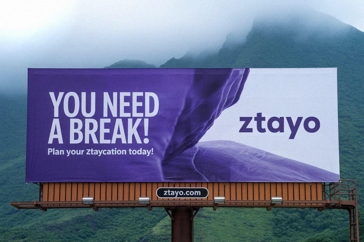
Wordmark
Ztayo’s wordmark is bold, clean, and modern - just like the brand. Its sharp, minimal style reflects clarity and confidence, while still feeling approachable.
To keep it impactful, the typography is always used as designed-no edits, no distortions.
Simple. Strong. Unmistakably ZTAYO.

Color
Ztayo’s colors say a lot about who we are. The bright purple brings energy and forward-thinking vibes, while the darjer version keeps things grounded and refined.
It’s a mix that feels bold, modern, and built to stand out-just like us.

RGB 136 48 255
CMYK 65 76 0 0

RGB 52 18 99
CMYK 93 100 25 24
Typeface
Our brand typography uses a carefully selected font pairing to create a modern, professional, and highly readable experience. We use Lexend as our primary font for headings and important elements, and Poppins as our secondary font for body text and supporting content.
Lexend - Primary Font
Used for: Headings, titles, navigation, and emphasis
Poppins - Secondary Font
Used for: Body text, descriptions, and supporting content
Typography Hierarchy
Main Heading (H1)
Lexend Semi-Bold, 48pxSection Heading (H2)
Lexend Medium, 36pxSubsection Heading (H3)
Lexend Medium, 24pxBody text uses Poppins Regular at 16px with optimal line spacing for excellent readability across all devices and print materials.
Poppins Regular, 16pxCaption text is smaller and uses Poppins Light for subtle supporting information.
Poppins Light, 14pxClearspace
We're a confident brand. We never crowd our logos and always give them room to breathe and stand out. The clear space around the Brand Symbol is based on the width of one element of the symbol. The clear space around the Logotype is based on the width of one character.
APPLICATION EXAMPLES


Contrast-Use Logotypes
Primary Color is our brand's signature color, but our Logotype does appear in black or white when necessary.

A pure white logo (#FFFFFF) may be used in scenarios where contrast is limited, such as when printing on paper, to ensure clarity and visibility.

Black Logotype examples: where use of color is limited by production.
Co-branding Principles
Some partnerships may be approved for a Brand-partner logo lock-up. When approved, the Brand logo should appear first, with equal size, placement, and prominence as the partner logo, and appropriate spacing maintained as per Brand guidelines. If the partner uses a symbol, the Brand Symbol should be used; if they use their full logo, use the full Brand logotype. The choice between the Brand Symbol and logotype can also depend on regional brand awareness, with symbols preferred in markets where the Brand is already well known.
BRAND SYMBOL + PARTNER LOGO

WORDMARK + PARTNER LOGO

Things To Avoid
Using our logos consistently ensures brand recognition and allows for creativity elsewhere. Avoid these usages.
AVOID: BRAND SYMBOL
AVOID: WORDMARK


